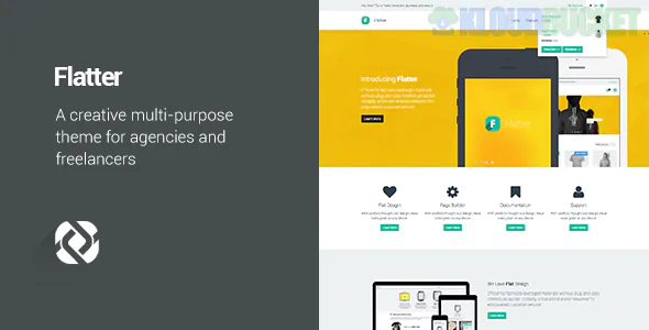
Flatter is a theme that lives up to its name—it is designed to make your content look its absolute best through flat design principles and seamless transitions. While Reendex is high-energy and "loud," Flatter is the "Sophisticated All-Rounder." It’s a multipurpose powerhouse that favors clean lines, bold colors, and a lack of three-dimensional effects (shadows/textures) to create a modern, "app-like" aesthetic.
It’s built for those who need a single theme that can transform into anything: a sleek business site, a vibrant portfolio, or a high-converting landing page.
The Flat Design Aesthetic: By stripping away shadows and gradients, Flatter ensures your site looks timeless and loads incredibly fast. It emphasizes typography and high-quality iconography.
Modular Versatility: It’s famous for its huge library of "Elements." You can mix and match sections from a corporate demo with the portfolio of a creative demo effortlessly.
High-Speed Performance: Because it avoids heavy visual effects, the code is leaner. This makes it an SEO favorite, as Google rewards the "snappiness" of flat-design themes.
Interactive Infographics: Includes specialized tools for progress bars, pie charts, and animated counters that match the minimalist flat style.
How does Flatter compare to the other "big" themes we've discussed?
Feature
Flatter (Flat Design)
Montserrat (Geometric)
Striped (Corporate)
Visual Style
Minimalist & Modern
Bold & Architectural
Structured & Traditional
Best For
Creative Agencies / Startups
High-end Branding
Logistics / Manufacturing
Complexity
Simple & Clean
High-end Layouts
Information Heavy
UX Focus
Ease of Navigation
Visual "Wow" Factor
Professional Authority
Flatter is structured to guide the user's eye using Color Blocking and Typography Hierarchy rather than complex graphics.
The "Impact" Header: A clean, wide-screen hero area with a high-contrast call-to-action.
The Features Grid: Using modern, flat-style icons to break down services into digestible "bites."
The Filterable Portfolio: A seamless grid that allows users to sort projects without the page refreshing.
The Social Proof Bar: A simple, grayscale logo slider for clients and partners to keep the focus on your brand colors.
Drag-and-Drop Builder: Typically optimized for Elementor or WPBakery, giving you total control over the "Flat" layout.
Responsive Control: Flatter is known for its "Pixel-Perfect" mobile scaling—everything aligns perfectly on a vertical screen.
One-Click Demo Import: Offers dozens of pre-made sites for niches like Medical, Creative, Corporate, and Shop.
Retina Ready: Ensures that your flat icons and sharp fonts look crisp on 4K and 5K displays.
To keep a flat design from looking "boring," you have to be smart with your Visual Assets:
Use Bold Accents: Pick one or two vibrant "Action Colors" (like electric orange or deep teal) against a neutral white or light grey background.
Typography is King: Since there are no shadows or textures, your font choice does the heavy lifting. Use bold, sans-serif fonts for headings to command attention.
Icon Consistency: Ensure all your icons come from the same set (e.g., all "Line Art" or all "Solid Fill"). Mixing icon styles is the fastest way to ruin a flat design.
Would you like me to help you pick a "Flat" color palette that matches your brand, or shall we look at how to structure your "About Us" section to fit this minimalist style?
Subscribe to access unlimited downloads of themes, videos, graphics, plugins, and more premium assets for your creative needs.
.jpg) Help Us to Buy More New Theme/Plugin
Help Us to Buy More New Theme/Plugin
Published:
Feb 03, 2026 12:41 PM
Version:
v1.6.5
Category:
Developer:
ThemeforestLicense:
GPL v2 or LaterTags: