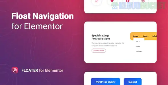
Floater is a specialized WordPress plugin designed for Elementor that adds a floating or sticky navigation menu to any page. Unlike standard sticky headers that simply "stick" to the top of the screen as you scroll, Floater allows you to place a navigation block in various fixed positions (like the side or bottom corners) that remains accessible to users regardless of their scroll position.
Developed by merkulove, it is a popular choice for improving mobile UX and increasing conversions by keeping key links or "Call to Action" buttons within thumb's reach.
8 Sticky Positions: You can anchor your menu to the top-left, top-right, middle-left, middle-right, bottom-left, bottom-right, and more.
Multiple Menus: You aren't limited to one. You can place different floating menus on a single page, such as a social media bar on the left and a "Contact" navigation on the right.
Two Menu Types:
WordPress Menu: Use your existing menus created in Appearance > Menus.
Custom Menu: Build a custom list of items directly within the Elementor widget with unique icons for each.
Dynamic Submenus: Supports multi-level menus with customizable animations and indicator icons (plus signs, arrows, etc.).
Toggle Options: You can choose to show the full menu immediately or hide it behind a "hamburger" or custom icon toggle.
Floater is built specifically for Elementor, so it uses the familiar "Content, Style, Advanced" tab structure:
Glassmorphism & Effects: Easily apply "frosted glass" (backdrop blur) effects, shadows, and glow animations to the floating block.
Responsive Control: You can set the menu to appear only on Mobile or only on Desktop, or change its position depending on the device (e.g., side-fixed on desktop, bottom-fixed on mobile).
Icon Library: Fully integrated with Font Awesome, allowing you to choose from thousands of icons for your menu items.
Pre-designed Templates: Includes 5+ ready-to-use stylized templates to help you get started quickly.
App-like Mobile Navigation: Creating a "tab bar" at the bottom of the screen for mobile users, similar to a native mobile app.
One-Page Navigation: Adding a vertical dot-navigation or list on the side of a landing page to jump between sections.
Quick Contact Bar: Floating a small menu with "Call," "Email," and "WhatsApp" icons that stays visible as users read your content.
Social Proof/Sharing: Keeping social share buttons or "Buy Now" links always visible on long blog posts or product pages.
Lightweight: It is designed for performance, loading minimal CSS and JS to ensure it doesn't hurt your Core Web Vitals.
Compatibility: Works with all modern browsers (Chrome, Safari, Edge, Firefox) and is fully translation-ready (includes .pot file).
SEO Friendly: The code structure follows WordPress best practices to ensure search engines can still crawl your menu links.
Would you like me to show you how to set up a "bottom-fixed" mobile menu using Floater, or are you looking for a specific CSS tip to make the menu background transparent on scroll?
Subscribe to access unlimited downloads of themes, videos, graphics, plugins, and more premium assets for your creative needs.
.jpg) Help Us to Buy More New Theme/Plugin
Help Us to Buy More New Theme/Plugin
Published:
Jan 22, 2026 11:02 AM
Version:
v1.0.9
Category:
Author:
OtherLicense:
GPL v2 or LaterTags: