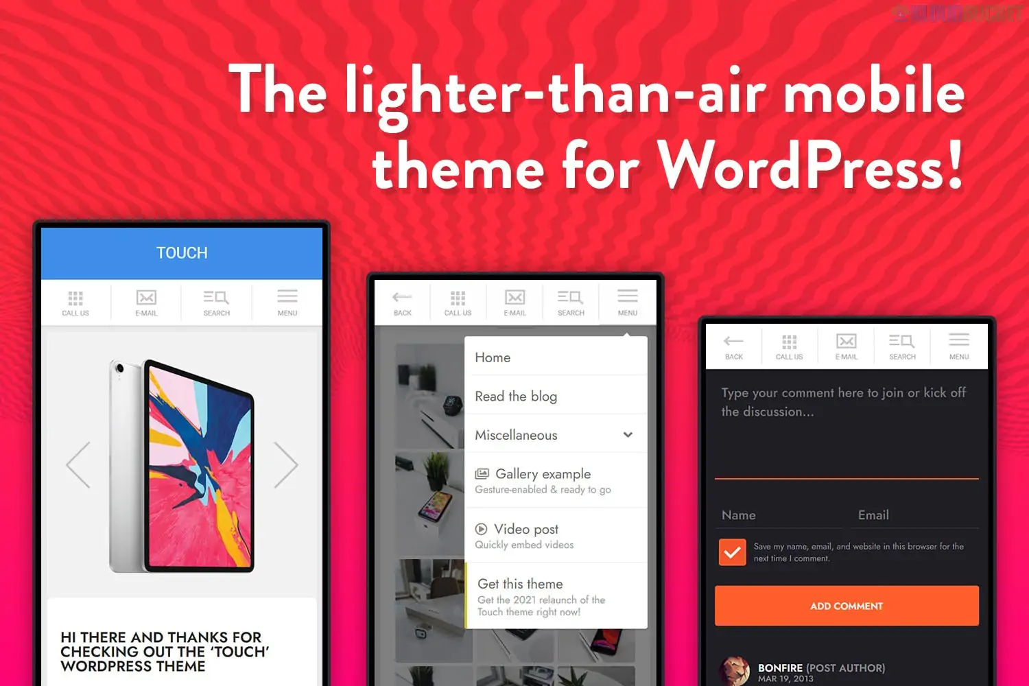
TOUCH is a highly specialized "mobile-first" WordPress theme. Unlike most modern themes that are "responsive" (meaning they shrink a desktop site down to fit a phone), TOUCH is designed specifically to be used as a dedicated mobile version of your website or as a standalone mobile-only web app.
It is famous for being incredibly lightweight, fast-loading, and mimicking the feel of a native iOS or Android application.
Extreme Performance: It avoids heavy scripts and "bloat," ensuring that users on slow 3G or 4G connections can access your content instantly.
App-Like Navigation: Features a "shelf" or "off-canvas" menu (the hamburger menu that slides out), which is the standard for high-end mobile apps.
Touch-Optimized Sliders: Every gallery and slider is built to respond perfectly to finger swipes, not just mouse clicks.
Retina Ready: Icons and typography are ultra-sharp, designed to look crisp on high-pixel-density smartphone screens.
Niche Specificity: While it’s multipurpose, it excels for Bloggers, Portfolios, and Agencies who want a secondary "mobile-only" experience for their users.
Shortcode Generator: Includes a library of mobile-friendly elements like buttons, toggles, and alert boxes that are styled to look like app UI components.
Social Integration: Heavy focus on "one-tap" social sharing icons, making it easy for mobile users to send your content to WhatsApp, X (Twitter), or Instagram.
Custom Backgrounds: Allows for beautiful, full-screen background images that don't interfere with the readability of the content.
Since TOUCH is a specialized mobile theme, you generally use it in one of two ways:
The Mobile-Only Site: You use this for a specific campaign or a "Link in Bio" style page where 100% of your traffic is coming from smartphones.
The "Switcher" Strategy: You keep your main desktop theme (like Strix or Shadowcat) for computer users, but use a plugin (like WP Mobile Edition) to automatically show TOUCH to any user who visits from a phone.
You have now explored the complete spectrum of specialized web design, from high-end corporate themes to ultra-light mobile shells:
Theme
Type
Focus
TOUCH
Mobile-Only
Speed, Swiping, and App-like UI
Resca
Restaurant
Menus and Reservations
Volare
Forum
Community Discussion (phpBB)
Palmela
FinTech
Security and Money Transfers
Ocularus
Photography
Visual Minimalism
Digee
Marketing
Growth and Conversion
If you are using TOUCH to create a mobile-first experience, pay close attention to "Thumb Zones." * Place your most important buttons (like "Contact" or "Order Now") in the lower two-thirds of the screen.
This makes it much easier for users to interact with your site while holding their phone with one hand.
Are you planning to use TOUCH as your primary website theme, or as a dedicated mobile version of an existing site? I can help you decide which configuration will provide the best user experience.
Subscribe to access unlimited downloads of themes, videos, graphics, plugins, and more premium assets for your creative needs.
.jpg) Help Us to Buy More New Theme/Plugin
Help Us to Buy More New Theme/Plugin
Published:
Jan 02, 2026 11:09 AM
Version:
v2.0
Category:
Developer:
ThemeforestLicense:
GPL v2 or Later